Re-designing a dashboard to increase user engagement
A deep dive on colour for data visualisations
Client
Marketplacer - 2018
Marketplacer - 2018
Sector
B2B / B2C E-commerce marketplace
B2B / B2C E-commerce marketplace
Role
UX & UI Design and research working with 1 x Front end developer
UX & UI Design and research working with 1 x Front end developer
The TLDR
My goal was to provide value to our new and existing users by repurposing the empty desktop page in their accounts and showing contextual snapshots of data related to sales, inventory and lead generation.
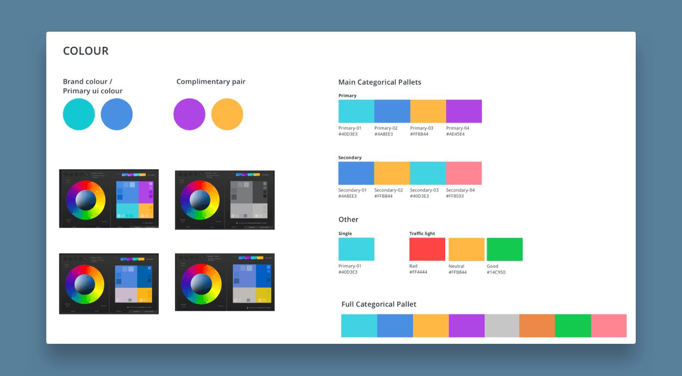
Colour palettes
Background —
As part of a new product launch and bigger project re-designing the user account Information architecture and primary navigation, I was asked to design a “pretty dashboard.” 🙄 - What every Product designer wants to hear.
Being part of a Marketplace platform we had both “consumers” and “retailers” of which there are a few different types. From here on in I will refer to the E-Commerce enabled retailer account users as “users” aka retailers on the platform.
Most existing users didn’t sign into their account as advert management was largely handled by product API feeds or internal operations teams.
Challenge —
Working backwards from the brief, I wanted to understand the core audience that would potentially see the dashboard, and what they might find useful.
Audience
A retailer with E-Commerce adverts
A retailer with Classified only adverts
A retailer with E-Commerce and Multistore(shared) adverts
Problems / constraints
Limited access to users(sellers) to validate what data to show
Very open-ended brief
Very tight timeframe (1 sprint)
Limited data available (GA, top generated reports)
Brand colour consideration, and a max of 4 colours for colour palettes
More than one graph shown at once
Approach —
My design process
Search basic Google analytics tracking for account use
Identify main user types & their top 3 priorities when signing in
Research data types and chart best practices
Research into data visualisation graph types
Research into colour best practices for data visualisation
Validate my hypothesis(goal) and designs with other members of the design team during a design weekly crit.
I feel a common pitfall of other dashboard designs I saw was showing too much information at once. The focus on what is important or actionable is then often lost. A graph without proper consideration and poor choice of colour, or a graph for the sake of showing a graph is not useful and can actually be counter-intuitive and confusing.
I chose to limit the dashboard to display actionable items, and only the top 3 most relevant insights for each user type as charts. I felt this was enough to delight and prompt action, without being overwhelming or showing secondary data for the sake of filling space.
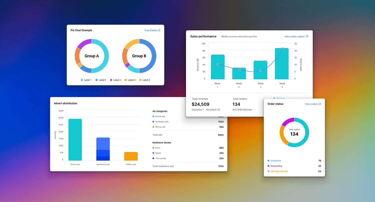
Each graph should be able to provide a contextual snapshot and a link to view a more in-depth report or page where an action is required.
My design process
Search basic Google analytics tracking for account use
Identify main user types & their top 3 priorities when signing in
Research data types and chart best practices
Research into data visualisation graph types
Research into colour best practices for data visualisation
Validate my hypothesis(goal) and designs with other members of the design team during a design weekly crit.
I feel a common pitfall of other dashboard designs I saw was showing too much information at once. The focus on what is important or actionable is then often lost. A graph without proper consideration and poor choice of colour, or a graph for the sake of showing a graph is not useful and can actually be counter-intuitive and confusing.
I chose to limit the dashboard to display actionable items, and only the top 3 most relevant insights for each user type as charts. I felt this was enough to delight and prompt action, without being overwhelming or showing secondary data for the sake of filling space.
Each graph should be able to provide a contextual snapshot and a link to view a more in-depth report or page where an action is required.
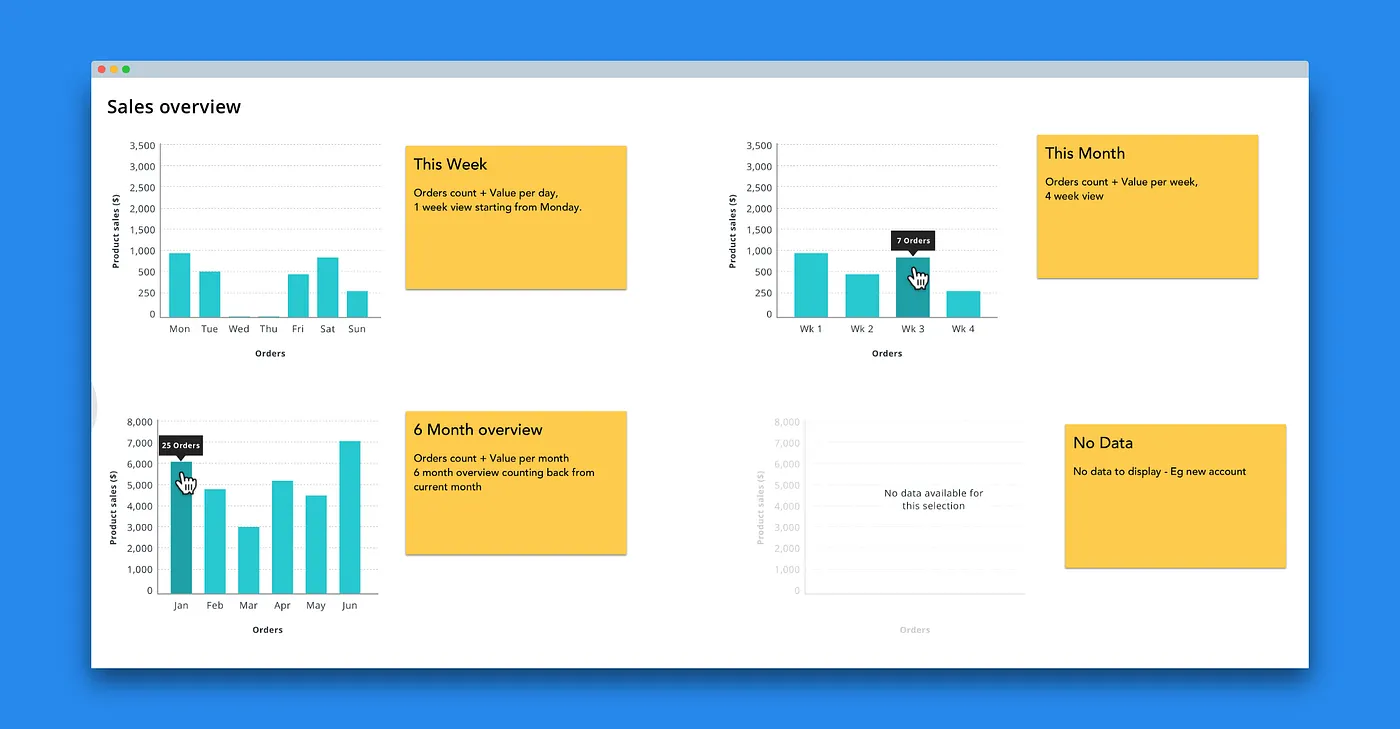
wireframe example of bar charts with top sales details
Results —
The charts were built in house by the development team using a combination of chart.js and custom components.
I found the data sets were simple and therefore didn’t require the complex palettes of 12 or more colours or the mathematical approaches of some of the other resources I looked into. I ended up creating the palettes for our visualisations from scratch as they needed to include brand colours as well as consider colour blindness and accessibility.
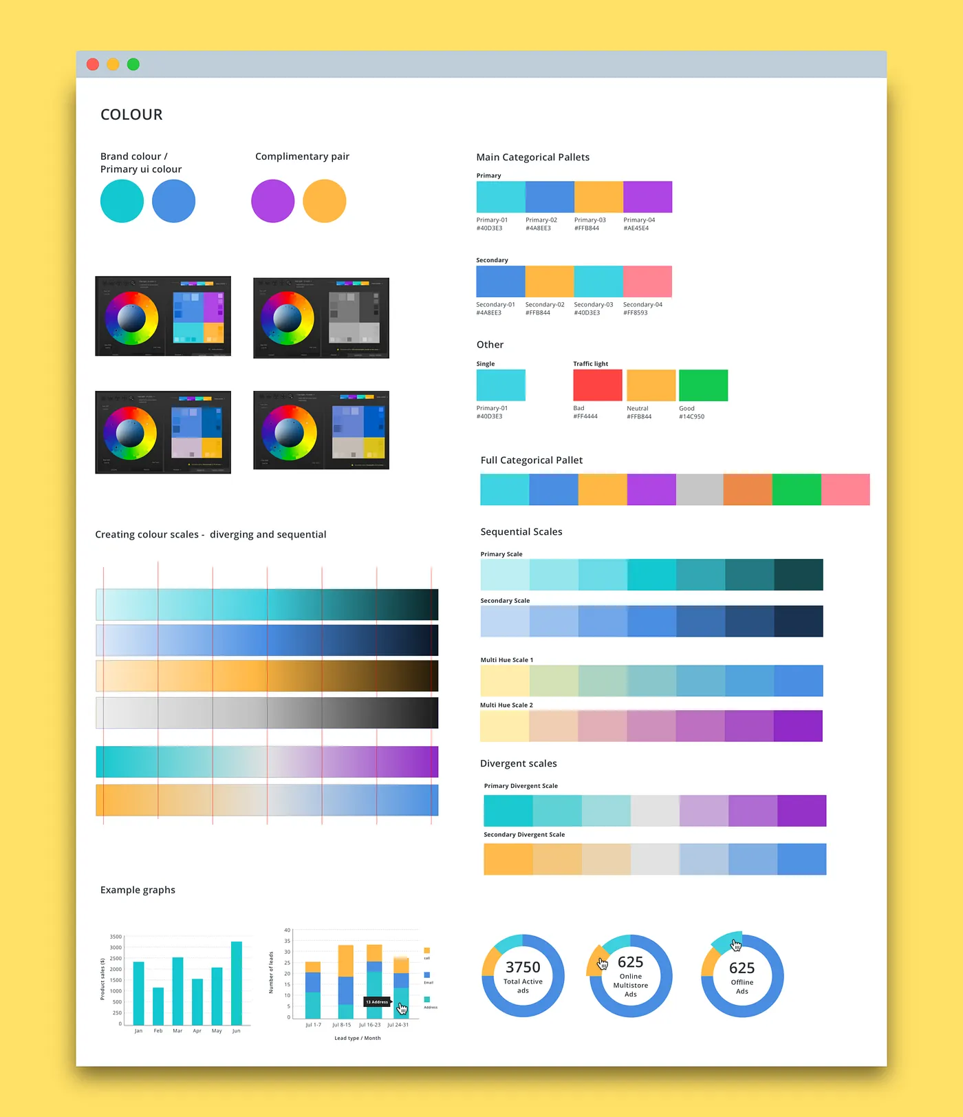
Colour palette
Outcome —
If time weren’t a pressing factor it would have been good to talk to sellers on the platform to get an understanding of what would provide value to them.
Unfortunately, the timeframe was tight, and the solution presented was only informed by conversations with the marketplace representatives, loose GA tracking data, and insights from most popular generated reports.
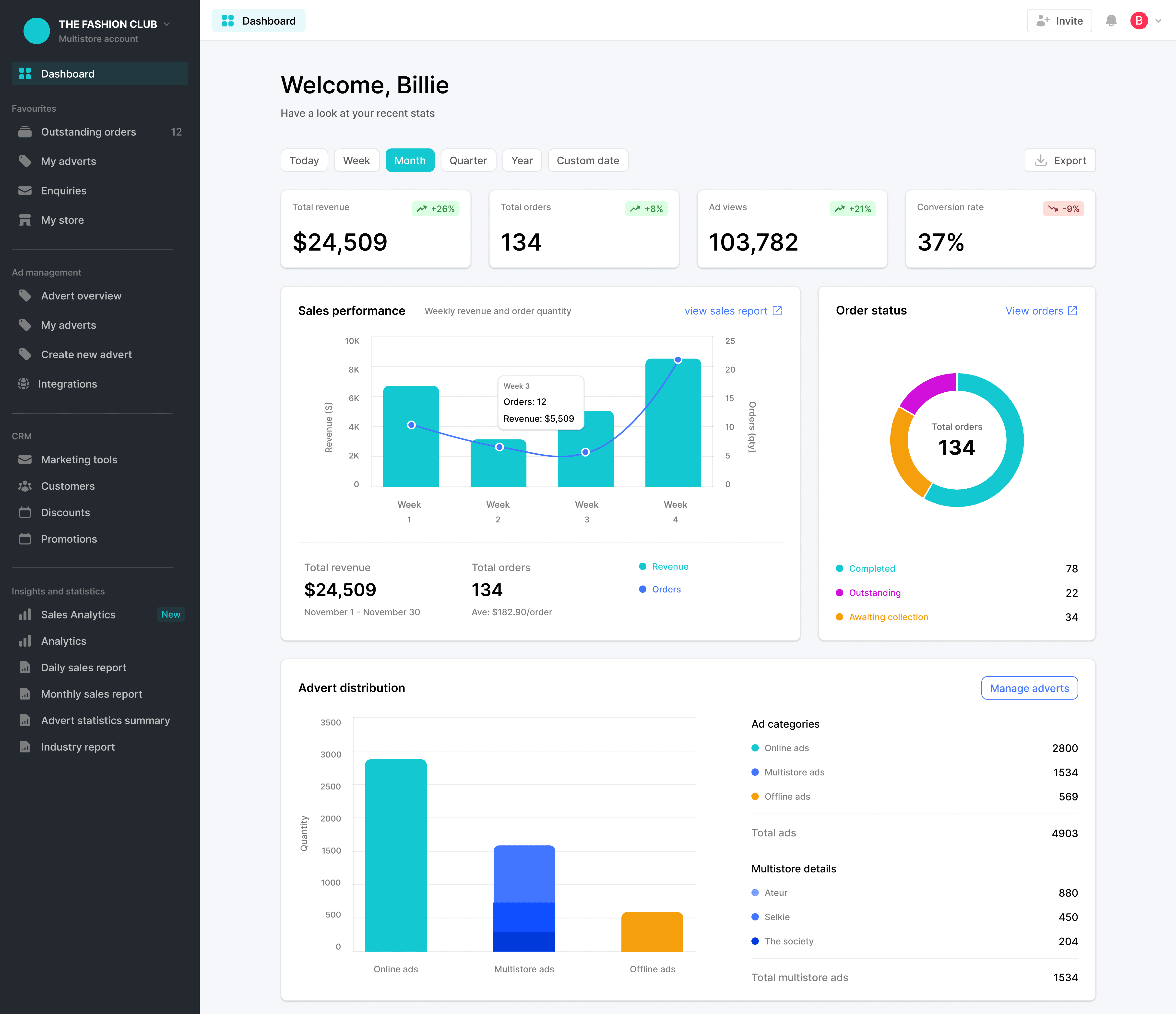
final dashboard design showing sales, ads, and order stats.
Takeaway —
My research into data visualisation was eye opening, and I learnt a lot, especially about how hard choosing colour for data viz is, I wrote a series of blog posts for the Marketplacer blog about the different steps.
External links:
Part 1: Data types and colours
Part 2: Colour schemes for data visualisation
Part 3: Data visualisation and DIY palettes